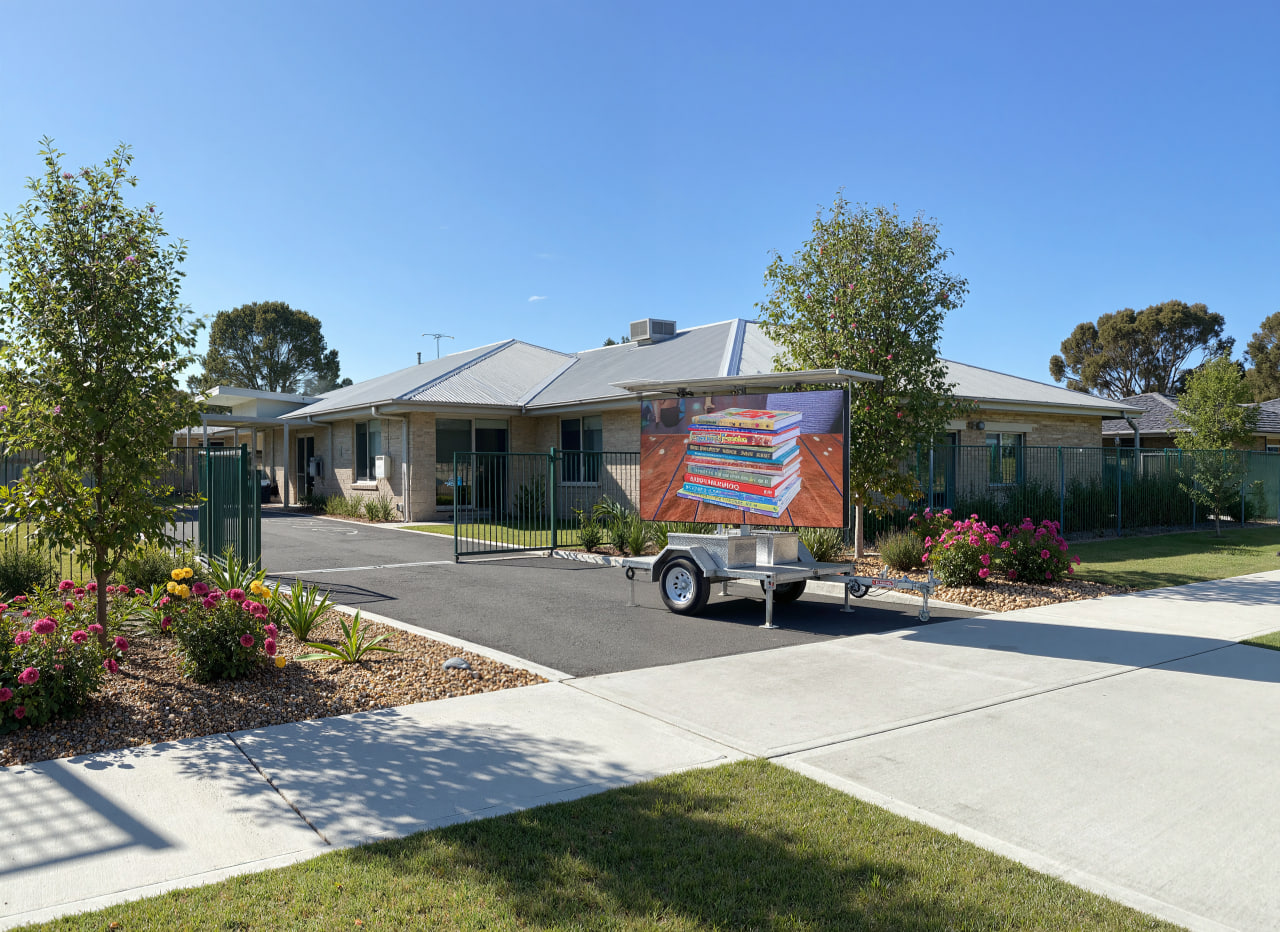
Even the brightest, most advanced mobile LED trailer can only do so much without the right content. As one industry expert notes, “without the right content, even the most advanced signage systems fall flat”. In other words, a flashy LED screen needs a clear, engaging message to truly capture attention. Content is what “grabs attention, communicates clearly, and drives people to take action”. In this guide, Signs of Success explains why content matters and shares practical LED sign design tips and content strategies that will make your message stand out. Our team at Signs of Success has years of experience in mobile LED sign hire and content support, so we’ll also explain how we can help you craft, upload, schedule and adjust your ads for maximum impact.
Why Content Matters (Even on a Bright LED Screen)
Mobile LED signs are eye-catching by nature. Their bright, dynamic displays naturally draw the eye — studies show colourful digital content captures attention far better than static posters. However, a big, bright screen is only half the battle. The message it shows is what keeps passersby watching and persuades them to act. As one digital signage authority explains, screens don’t create impact on their own — content does. Good signage content is clear, concise and immediately relevant to the viewer. It tells people what they need to know (“Sale today only!”) and what to do next (“Call now!” or “Visit today!”), so it turns heads and drives action.
Signs of Success lives and breathes content strategy. Our goal is not just to park a bright sign in front of your business, but to ensure the words on the screen work hard for you. Even a technically perfect sign will “fall flat” if the copy is confusing or too busy. For example, a short, punchy message in bold letters will always be more effective than a cluttered announcement. That’s why we work with clients on their message as well as their media: great content makes a great sign.
LED Sign Design Tips: How to Make Your LED Ads Stand Out
When it comes to LED sign design tips, certain best practices can help your LED ads stand out and be easily read on the move. Think of your content like a banner: the simpler and bolder, the better. In practice, this means:
- Keep text very short. People see mobile LED signs while passing by, so they only have a few seconds to read. Limit your message to a few words per line – ideally no more than 3–5 words per line and just a few lines total. Experts call this the “3×5 rule” (3 lines of text with 5 words per line, or vice versa) to maximise readability. For instance, a single frame might say: “SALE TODAY – 20% OFF!”. Long sentences or paragraphs won’t get read.
- Use high-contrast colours. Your text should sharply contrast the background so it’s legible from a distance. For example, white or yellow text on black/dark background, or black text on a light background, is usually best. Avoid combinations like red-on-green or grey-on-white that are hard to read. A high-contrast palette immediately makes the letters pop, even in bright daylight.
- Choose bold, simple fonts. Sans-serif fonts (like Arial, Helvetica or Calibri) in bold weight are ideal because they read easily on screens. Don’t use fancy script or thin display fonts – they blur together at a distance. Stick to one or two font styles at most, and make your main message the largest text on the screen. For example, a bold font in all caps for a headline (e.g. “NOW OPEN!”) instantly grabs the eye.
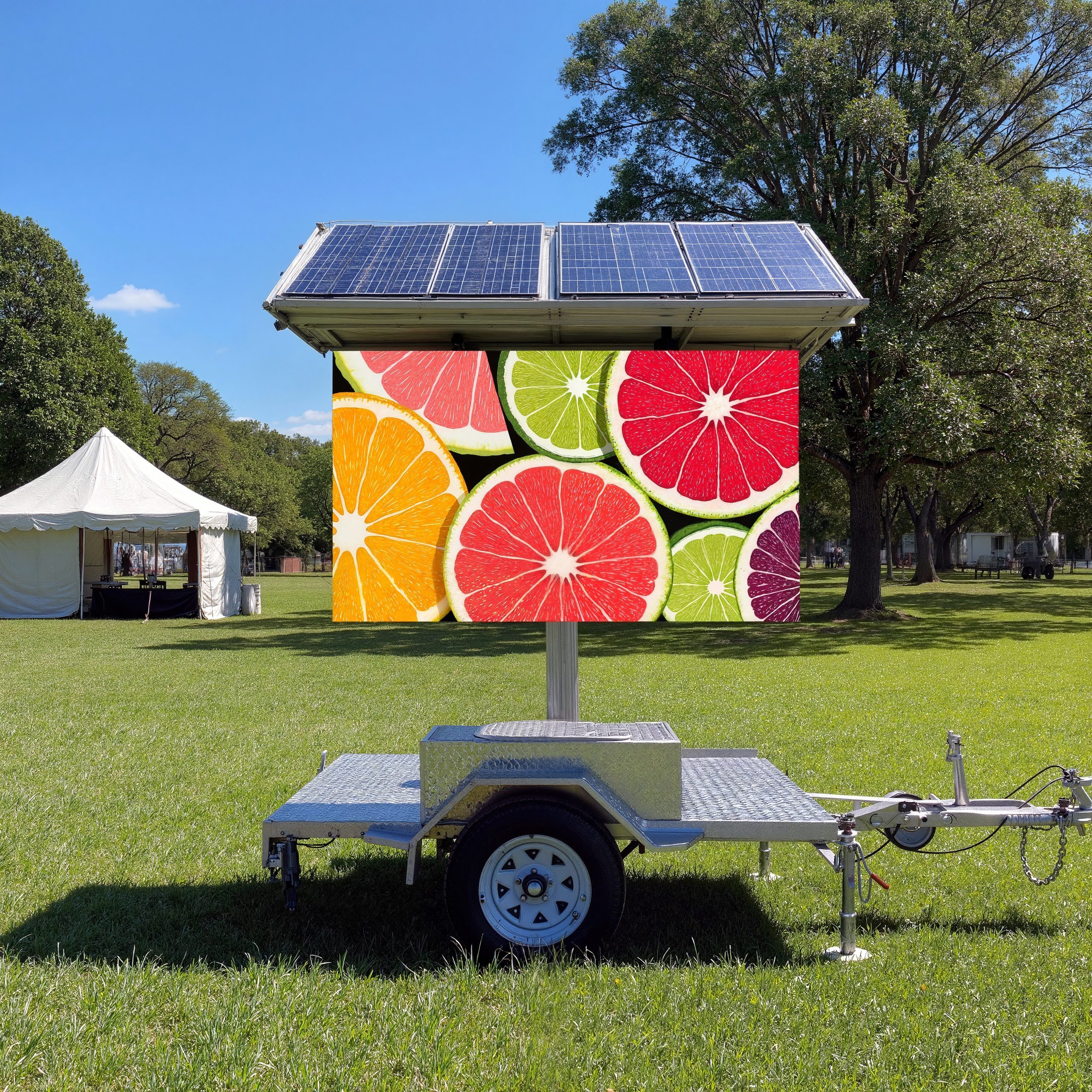
- Limit colours and graphics. While bright colours attract attention, too many different colours or busy images will clutter the display. A good rule is the 60-30-10 colour rule: 60% one main colour (background), 30% a secondary colour (headline text), and 10% an accent colour (for highlights or a logo). Also, avoid full-screen photos or complex patterns behind text. A solid or lightly textured background with plenty of blank space around the words makes your message crisp.
- Include white space. Don’t feel you must fill the whole screen with content. Ample blank space around your words actually improves readability. Experts often recommend that text cover only ~40% of the display, with the rest left empty or minimal. This “breathing room” prevents visual overload. For example, an effective sign might have just 3 short lines of text centered on a dark background, rather than dozens of lines crammed in.
By following these design tips, you ensure passersby can absorb your message in the split-seconds they have. Simplicity + contrast + boldness = a design that pops. These LED sign design tips will help you create content that stands out in anyone’s feed.
Effective Messaging and Calls-to-Action
Eye-catching design won’t do much without a clear goal for your viewer. Every LED sign should end with a strong call to action – a prompt telling the audience exactly what to do next. Phrases like “Visit Today!”, “Limited Offer!”, “Call Now!” or “Now Open!” are classic examples. They use action verbs (“visit”, “call”, “act”) and often a sense of urgency (“limited”, “now”) to spur immediate response. Here are some tips for crafting effective CTAs on your LED sign:
- Be clear and concise. Your CTA should fit on one line and be extremely straightforward. Think in terms of commands: “Shop Now!”, “Join Today!”, “Enter to Win!” – short, punchy phrases of 2–3 words. For example, a grocery store might flash “SAVE 10% TODAY” or “SHOP OUR SALE” in big letters. Avoid vague language. If you want people to come to your business, “Visit Today!” or “Shop Now” works far better than “Check us out.” As one signage guide points out, CTA phrases as simple as “Follow us”, “Get 25% off” or “Buy” are most effective. Likewise, Signs of Success recommends CTAs like “Visit Today!” or “Call Now!”, because they directly tell viewers what action to take.
- Create urgency. Scarcity motivates action. If your offer or opening is time-sensitive, say so. Phrases like “Limited Offer – Act Now!” or “Only 3 Days Left!” trigger a fear-of-missing-out. For instance, a retailer flashing “TODAY ONLY” in red letters lets customers know they must hurry. Signage experts advise using trigger words (“now”, “today”, “hurry”) sparingly to convey urgency. The key is to strike a balance: giving a reason to act soon, without overstating it. For example, a coffee shop might run “FREE COFFEE! First 10 customers,” or a real estate agent might announce “Open House – This Sat!” – each adds a deadline that pulls readers in.
- Tailor your language. Match the tone of your CTA to your audience. A sign outside a construction site will use different wording than one at a nightclub. Keep it friendly and on-brand. But no matter what, use strong verbs (visit, call, claim, hurry) and avoid passive phrasing. Even just adding the word “now” (e.g. “Book Now!”) can significantly boost response. In short, make your CTA specific. Telling customers exactly what they get (a discount, information, an item) and how to get it (call, scan, visit) is far more effective than a vague enticement.
In practice, Signs of Success has seen these tactics work time and again. For example, one mobile LED campaign for a cafe simply read “GOOD MORNING – FREE MUFFIN. Visit Today!” in bright bold letters. The concise message plus action verbs had customers stopping by throughout the day. By contrast, a poorly worded sign with no CTA might catch the eye but miss out on conversions.
Timing, Readability and Message Loops
Timing is as important as wording. Even a well-designed, clear message won’t help if it flashes by too quickly or lingers too long. Research shows that the average passerby (walking or driving) only views a display for about six seconds before moving on. In other words, your message loop should rotate roughly every 6–8 seconds so each slide is visible long enough to read, but not so long that people get bored.
To put it in practice:
- 6–8 second rule: Plan your slides so that each can be fully read in about six seconds. A handy test is to read the message out loud. If you can say all the words within that time, viewers will too. For example, a sign with “Ice Cream – Only $5 Today” should comfortably fit that window. If a viewer takes longer than six seconds, shorten the text further. Signs of Success often advises clients to read draft messages aloud against a 6-second timer to verify clarity.
- Repeat key messages: Since people may see your sign only briefly, it’s fine to repeat important messages. In a 30-second loop, you might show the headline “Weekend Sale” multiple times or intersperse it with the promo details. Repetition helps catch those just entering the zone and reinforces the info for slow readers.
- Avoid cluttered loops: Keep each slide simple. Do not try to cram 10 images or 50 words into one frame. As noted earlier, less is more – especially when time is limited. Use one main graphic or phrase per slide. For quick reviews, some designers suggest “point-of-transit” slides should have no more than 5 words. If you have more to say, break it into multiple slides rather than one crowded one.
- Ensure readability: Beyond contrast and font, consider viewing distance. Signs of Success typically mounts LED screens at eye-level along roads or at events. From a few metres away, our content must still be legible. Therefore, text size, line spacing and boldness are double-checked before any campaign. Customers are often surprised how much bigger letters have to be than they expect! If in doubt, we err on the larger side.
- Avoid visual distractions: No matter how attractive your animations or backgrounds, they should not distract from the core message. That means no rapid flashing graphics or hard-to-read animations. If you do use movement (like a ticker or scroll), make it smooth and not too fast. The focus should remain on reading the words. As a rule of thumb, Signs of Success clients find the most success with static text slides (possibly with minor fade/scroll effects) rather than strobing animations.
By carefully timing each slide and keeping them clean and uncluttered, your mobile LED sign becomes much more readable. An effective loop might look like: Slide 1 (3 seconds): “SALE – 20% OFF ALL OUTDOOR GEAR”, Slide 2 (3 seconds): “Today Only!”, Slide 3 (2 seconds): “Visit Us Today! 👉”. Each is visible, short, and then it repeats in time for another glimpse. Overly long or complicated slides simply risk being skipped by hurried viewers.
Mobile Sign Content Ideas by Industry
Different industries have different audiences and goals. Here are some mobile sign content ideas tailored to common scenarios. Feel free to adapt these to your business:
- Retail Stores and Shopping Centres: Use LED signs to promote current specials and sales. For example, display flash sales, clearance events or discount codes. As one digital signage guide notes, stores can “display anything from discount codes to … special promotions” on in-store screens. A clothing retailer might flash “SUMMER SALE – 50% OFF!” in big letters, or show a rotating list of clearance items. You can also highlight new arrivals or loyalty program deals (e.g. “Earn 2X points today!”). Animated graphics like shopping bag icons or left-pointing arrows can draw attention. Bottom line: keep it seasonal and timely – updating deals weekly or even daily, since content is digital.
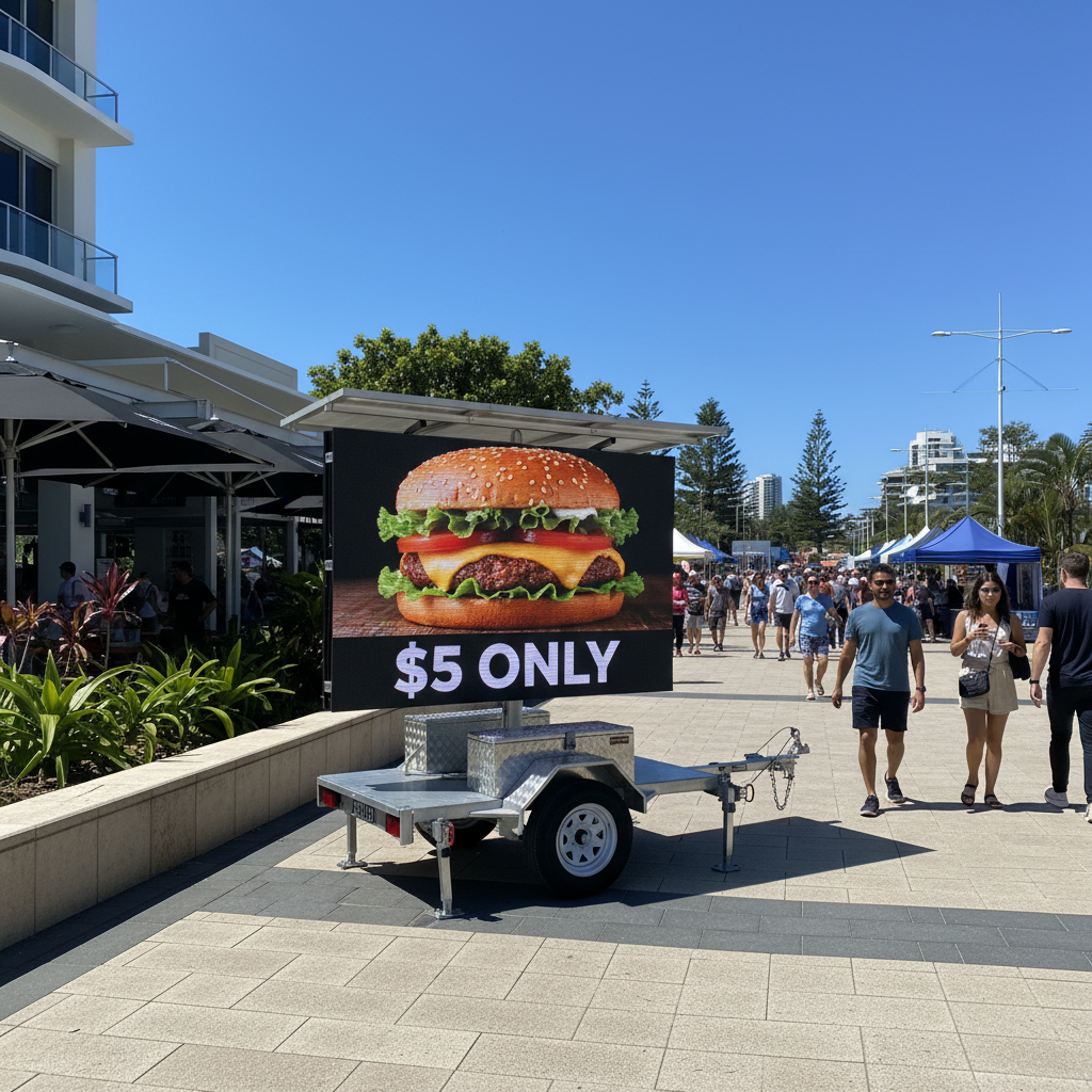
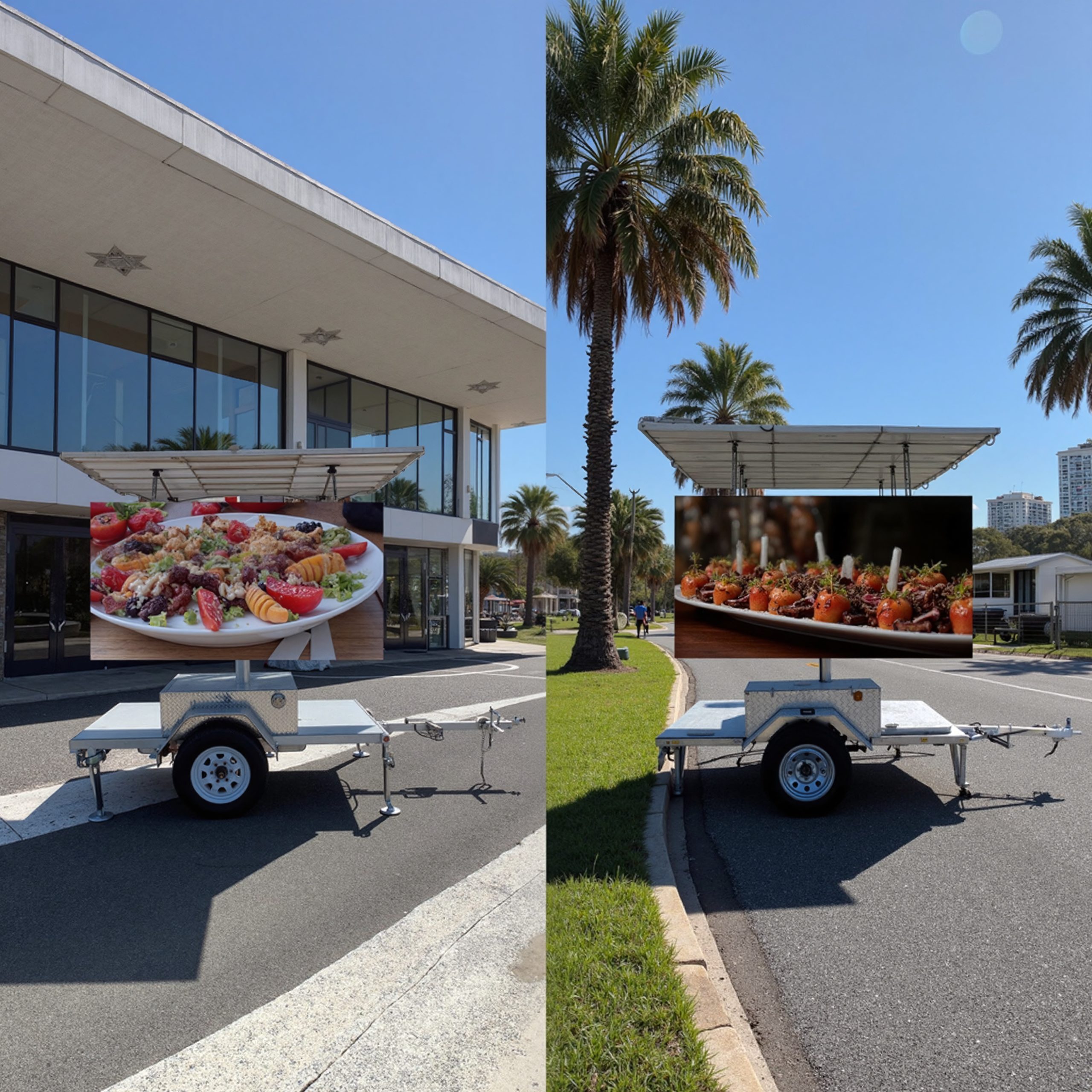
- Food Trucks, Cafes and Restaurants: Digital menu boards and daily special boards are game-changers here. Replace hand-written menus with bright, updateable LED slides. Showcase your best dishes with photos or animations. For instance, a food truck could have a slide that flashes “DAILY SPECIAL – Beef Tacos $8” alongside an image of the taco. Cafes might promote combo deals: “Coffee + Muffin – $9 Only!”. Even allowing QR-code ordering can be featured on the sign. As noted by a leading signage firm, restaurants and cafes can use digital displays to present their menus in a “completely customizable and visually captivating” way. This not only looks modern, but lets you change prices or items instantly (e.g. sell out of an item and replace it on the spot).
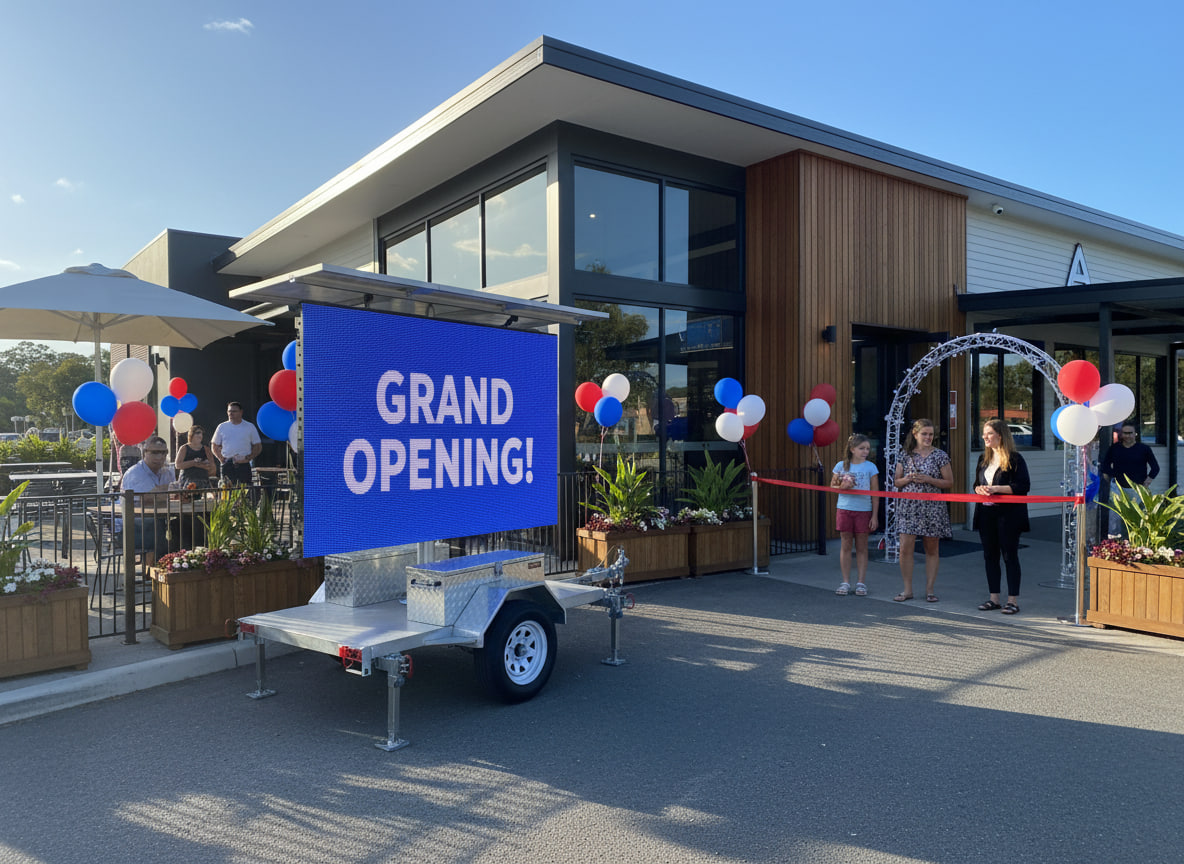
- Events and Exhibitions: Use LED signs as dynamic event billboards. Before an event, show a countdown: “Conference in 5 days – Register Now!” or “Only 3 hours to go until Market Opens”. One content guide observes that countdowns (e.g. “Only 5 hours left!”) build excitement and can drive attendance. At the event itself, display schedules, booth numbers or maps on your mobile LED. For example, “Tonight: Live Band at 7pm” or “Main Stage This Way →”. You can also loop sponsor logos or highlight speakers. A well-timed notice (“Doors open in 10 min!”) ensures guests don’t miss anything. Events often require on-the-fly updates, which is easy with digital content (Signs of Success can remotely push these changes).
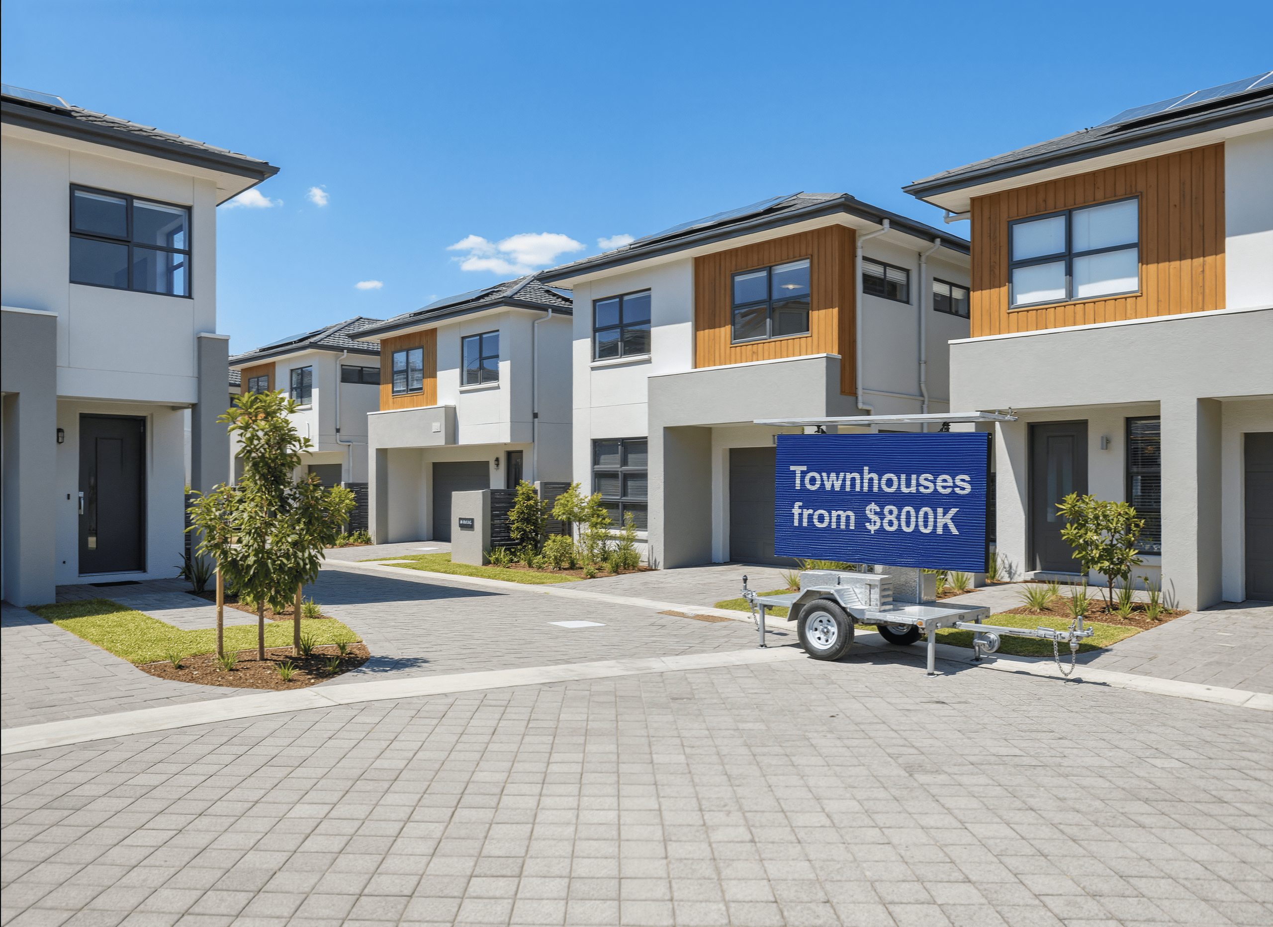
- Real Estate Open Houses: A mobile LED sign is perfect for real estate agents. Instead of static A-frames, advertise “OPEN HOUSE – 123 Main St – This Saturday 2pm”. You can include the agent’s photo and phone number. One expert notes digital signage makes sharing open-house schedules “easier to read and keep updated” than smudgy whiteboards. Change the slide each week to match new listings. Also consider showcasing “Just Sold” or price reductions (“NOW $450k!”) to generate urgency. A moving LED sign can even circle neighborhoods with properties, acting as a mobile billboard that guides people to the homes.
- Bars, Clubs and Entertainment: Promote happy hour specials or events. E.g., “Karaoke Night – 8pm Mondays”, “2 for 1 Cocktails – Fri 5–7pm!”, or “Game Day Live: Join Us for Footy!”. Bright animated graphics (beer mug, guitar, sports icons) can highlight the fun atmosphere. These venues can also display quick testimonials or photo slideshows of happy customers (with consent), adding social proof.
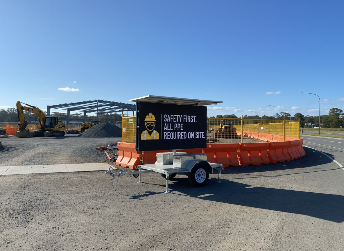
- Promotion at Public Venues: Think outside the box – even libraries, gyms, charities or schools can use mobile signs. A gym could advertise “New Yoga Class – Starts Thurs!” outside a local festival. A charity at a fair might flash a QR code and “Donate $5 Now”. Trade shows often rent mobile signage to stand out; a creative graphic plus “Visit Booth #12” can drive foot traffic. Even construction sites are using them now to post safety tips or project updates.
These examples scratch the surface of “mobile sign content ideas”. The key is relevance: match the message to your industry and location. For any business, short calls-to-action (“Call now!”) mixed with key info (hours, prices, event times) work best.
Good vs. Bad Sign Design (Examples)
It often helps to compare effective and ineffective designs. Here are two hypothetical examples to illustrate the difference:
- Good Design Example: Imagine a food outlet’s LED sign that simply reads “LUNCH SPECIAL – Chicken Wrap $5.99” in huge white letters on a deep blue background. The text is bold, sans-serif, and covers perhaps 30–40% of the screen, leaving plenty of blue space around it. It uses high contrast (white on blue), a short, clear message (only 4 words plus price), and a friendly arrow icon pointing to the entrance. This slide loops for about 6 seconds, then repeats. Such a clean design is easily legible day or night and quickly communicates the deal.
- Poor Design Example: By contrast, imagine a sign that lists a dozen menu items in red Comic Sans on a yellow background, with a flashing “Buy 1 Get 1 Free” banner and a low-res photo behind the text. This design violates many rules: the red-yellow combo is jarring and low-contrast, the fancy script font is hard to read at a glance, and the text is far too small and cluttered. Anyone driving or walking past wouldn’t be able to focus on one message. It also overloads viewers with information, making it impossible to absorb on the go.
In practice, we consistently recommend the good style: big, bold, few words, high contrast. For example, a retail client replaced a hastily thrown-together slide of dozens of items with a simple “WINTER SALE – 40% OFF TODAY” banner. The result? Customers reported it was much easier to read and it drove an immediate uptick in foot traffic. Key takeaways: avoid font and color combinations that “cause visual discomfort”. Follow readability rules (like the 3×5 rule and 40/60 spacing) to create a sign that people can actually read and act on.
How Signs of Success Can Help You
At Signs of Success, we don’t just rent out the trailer and walk away – we partner with you throughout your campaign. Here’s how we make sign content easy:
- Remote Content Updates & Scheduling: Our LED units are wirelessly connected to a central system. You can hand over existing ads or draft new ones, and we upload them for you. Need to change a message quickly? We can push an update instantly from our office, or schedule different ads for different times of day. For example, one client runs a “Lunch Special” slide at noon and a “Tonight’s Entertainment” slide at 6pm on the same sign. Unlike printed billboards, you’re never stuck with stale content.
- Content Assistance: Our team has deep experience with what works on mobile LED screens. If you need help, we’ll assist in designing and formatting your messages. Maybe you have a logo and some text, and we’ll help make it pop on screen. We advise on contrast, fonts, and even phrasing. Signs of Success offers basic ad design – we’ve tweaked thousands of signs, so we know how to make your wording clear and impactful. It’s like having a sign content consultant included in your hire.
- End-to-End Service: From delivery to placement, our crew handles the logistics. We park the trailer in your chosen spot and set it up for optimal visibility. You won’t need to wrestle with cables or software – we take care of initial setup. During the campaign, if you think of a new promotion or event, just call us. We’re on hand to revise your slides and keep your messaging fresh. When it’s over, we promptly remove the trailer. Our clients appreciate that “you don’t have to lift a finger” – Signs of Success manages it all.
Because we live and breathe mobile LED signage, our advice is backed by years of results. We’ve helped cafes, shops and realtors craft messages that consistently draw attention. Whether you need help brainstorming catchy headlines or technical support to schedule a day’s worth of ads, Signs of Success can make your signage campaign seamless.
Work with the Experts at Signs of Success
In summary, a great mobile LED sign combines bright hardware with brilliant content. By using short, high-contrast text and clear calls to action, and by timing your slides for quick glances, you’ll maximise every dollar of your outdoor advertising. Signs of Success is here to guide you every step of the way. We offer a true digital signage advertising guide with hands-on support – from planning your message to hitting “play” on the big screen.
Ready to make your LED ads stand out? Contact the team at Signs of Success for expert help designing, uploading and scheduling your mobile sign content. We’ll work with you to ensure your message is not only eye-catching, but effective. Reach out today and let us turn your sign into a Sign of Success.