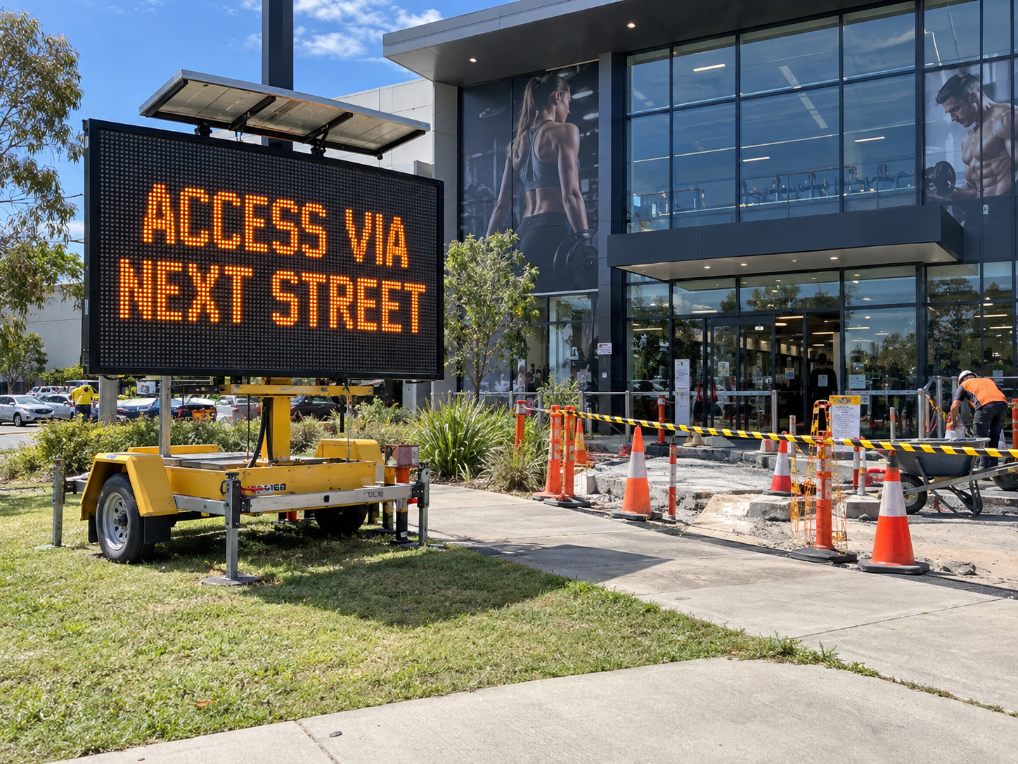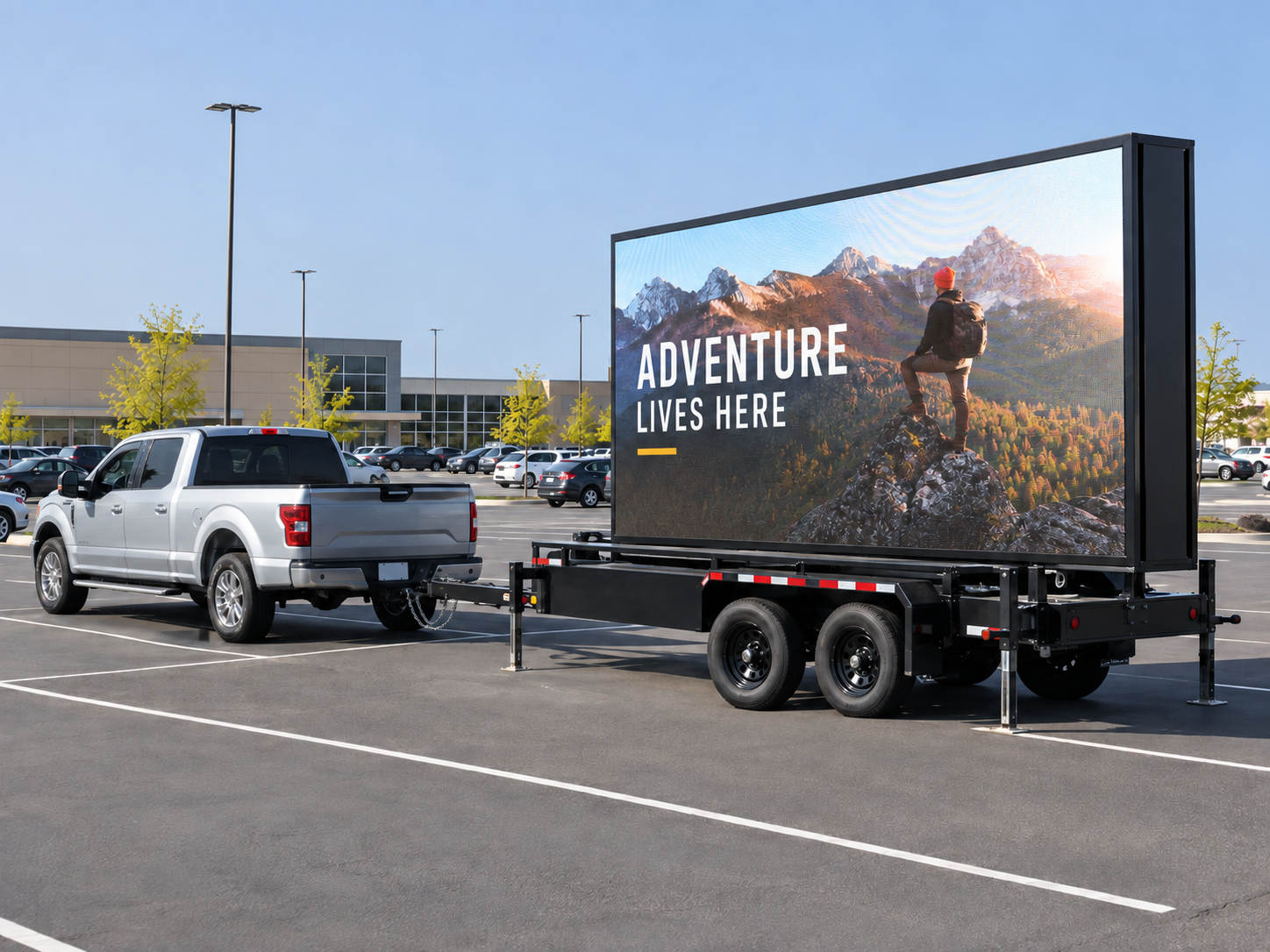
In a busy traffic environment, a mobile digital billboard has only a few seconds to capture attention. That means your content must be bold, simple and instantly readable. Industry experts agree that effective mobile billboard creative should feature one clear message, high-contrast graphics and very little text. Drivers see a roadside sign for only 3–10 seconds, so limiting your wording to around 7–10 words or fewer is crucial. In practice, that often means a single strong headline, a simple visual or logo, and a concise call-to-action. At Signs of Success, we specialise in designing LED trailer ads that “keep it uncluttered – think one big call-to-action per slide”. Our team can help you focus on the single point you want passing motorists to remember.
For example, if you’re running a clearance sale, one slide might simply say “30% OFF – THIS WEEKEND” on a plain background (with your logo), rather than listing every product or condition. As one design guide notes, “nothing should be complicated” – “only one message or idea per slide”, with plenty of empty space around it. In other words, resist the temptation to cram multiple deals, images and disclaimers into one screen. The human eye needs time even to see a full screen at speed, let alone read lots of text.
Keep Text Minimal: Headlines, Numbers and Calls-to-Action
The golden rule for billboard copy is: “Say it in less.” Aim for a maximum of about three lines of text with 3–5 words each, or 5 lines of 3–4 words. In practice at Signs of Success, we often recommend no more than 3–5 words per line and a total of 10–12 characters across to ensure legibility from the road. For example, a slide might be “AUCTION SAT 12PM” (3 words, 12 characters) or “SALE TODAY – HALF PRICE” (4 words). This keeps messages punchy and easy to digest at a glance.
Long sentences or multiple offers on one screen just won’t work. One industry study warns that even a highway billboard with 5–10 seconds of viewing should avoid lengthy text, suggesting no more than 9 words in total. In our experience with mobile LED signs, less is definitely more: fewer words mean drivers can read and respond before they pass. Signs of Success will help trim your copy to the core message and strongest call-to-action. Remember, you can always use the next slide to say something different – better to run two or three rotating slides than to overload one.
Font, Size and Contrast: Make It Pop
Even the perfect few words must be easy to see and read. Use large, simple fonts and high contrast between text and background. Bold, sans-serif typefaces (like Arial or Helvetica) work best, especially on moving vehicles. Thin or decorative scripts can disappear in motion. A useful rule of thumb is that each inch of letter height can be legible from about 20–25 feet. In practice, this means your billboard letters should be as tall as practical – think several centimetres if you were designing for a computer screen, or easier: ask us, since we tailor fonts to our screen size and expected distance.
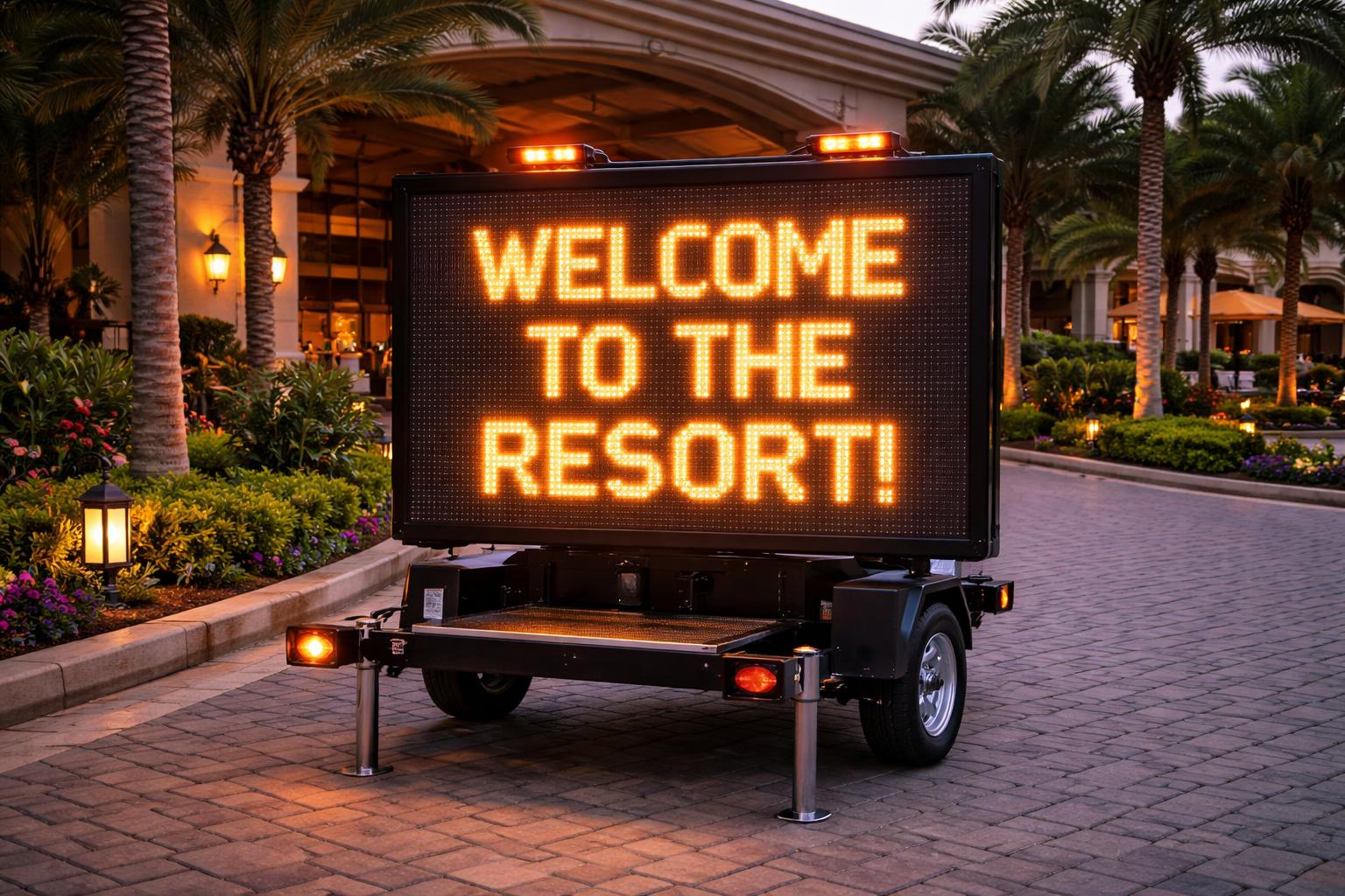
Colour choices are equally important. Always pair light text with a dark background or vice versa for maximum readability. For example, white letters on a royal blue or green background, or yellow on black, tend to stand out vividly. Signs of Success screens are very bright (suitable for daytime sun), but contrast is still key – we advise clients to avoid subtle pastel-on-pastel designs that would wash out in sunlight. As one signage expert notes, high contrast “ensures legibility even from a distance”. We’ll test your design on the trailer before deployment to be sure the message “pops” for passing motorists.
Static Slides vs Animation: Use Motion Sparingly
Because the screen is digital, you might be tempted to add lots of moving animations. However, too much motion can distract or even annoy viewers. On a roadside billboard, the safest approach is often a static slide or very gentle transition. Queensland road-safety guidelines actually restrict rapid flashing or moving elements that could be confusing, so we recommend keeping animated changes slow and simple.
A subtle fade or slide between related messages is fine. But avoid “wild” effects like rapidly spinning graphics or pulsating text. If you do use animation, make sure it serves the message, not overshadows it. For example, you might fade in a logo or do a gentle panning shot of a product. In contrast, constant ticker text or flashy videos can make it much harder for a driver to read the actual offer. In practice, think of each slide like a clean billboard poster: bold and static. We can then rotate between a small number of slides to update the offer over time, rather than scroll multiple ads in one go.
Timing Your Slides: How Long to Display Each Message
Along with limiting content, you should also consider slide duration. Because drivers are moving, each slide should remain on-screen just long enough to be read, but not so long that people lose interest. Industry guidance suggests an average of about 3 seconds per slide. We typically plan for each message to display 3–5 seconds before moving to the next related slide. This lets passing vehicles catch the message without seeing the same slide the whole time.
Signs of Success helps schedule your content: for instance, a promotion slide might run for one day, then we switch to a “final day” slide on the last day, building urgency. Or on a particularly busy road (a “Point of Transit”), 2–3 seconds might suffice since people are really on the move. For a slower area or pedestrian zone, we might allow 4–6 seconds so people have time. In any case, the key is to plan your updates. Simply displaying one image all day is usually a waste; instead, use the digital capability to give viewers multiple chances to absorb the main message.
Images and Layout: One Strong Visual
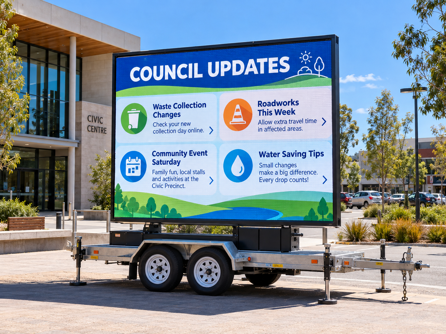
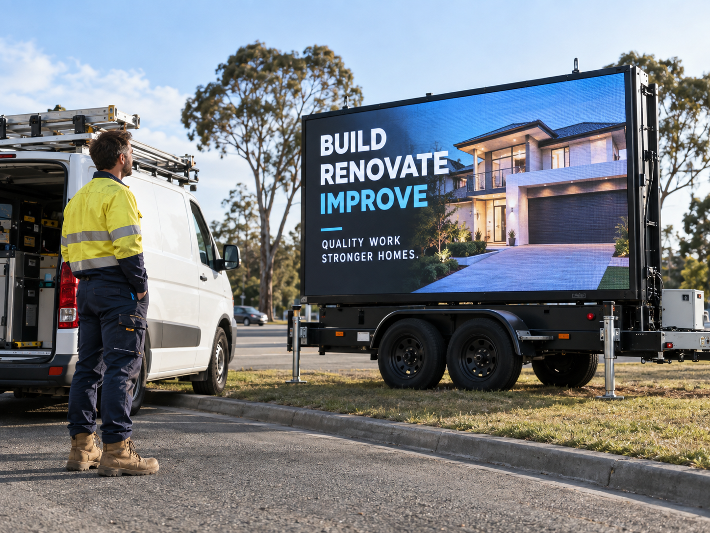
Images can catch the eye – for example, a product shot, a map, or a logo – but they must remain simple. Use one clear image or graphic per slide at most. Avoid stuffing multiple photos or small pictures onto the screen, which just looks cluttered. Billboard design experts advise picking “one sizeable primary picture” rather than several small ones. If you do use a photograph (say, of a new book or vehicle), make sure it has high resolution (so it looks sharp at screen size) and high contrast with the overlay text.
Generally, we find that a single bold image works best as a background with overlaid text that is easy to read. Alternatively, some clients run a “slide cycle” where one slide shows a product photo with minimal text, and the next slide shows text in the same style (this can reinforce the message without cramming everything together). For example, a retailer could alternate between a colourful product image (“New Coffee Machine”) and a text slide (“50% OFF — TODAY ONLY”), drawing the eye and keeping things dynamic.
The bottom line is: don’t dilute your message with too many visuals. Let the text deliver the offer or call to action, supported by one impactful image if needed. Signs of Success will help you choose or design any images so that they support legibility – for instance, using a translucent overlay under text if needed – and we always confirm that your creative meets our high-contrast, high-resolution standards.
Calls to Action: Direct and Memorable
Your billboard should clearly tell viewers what to do next. Common actions include “Turn Left”, “Call Now”, “Book Today” or “Visit Our Website”. However, the format must fit the context. For a moving audience, avoid long or complex instructions. For example, a simple direction like “NEXT LEFT” or “SHOP NOW” is quick to process. Signs of Success usually helps clients pick short domain names or codes if needed – for instance we might shorten “Visit www.vacationsuperstore.com.au” to “Visit vacaysupersale.com” on the billboard, or better yet a memorable short URL.
Phone numbers are generally not very effective on moving billboards – there’s little chance a driver will dial on the spot. If you use one, make sure it’s very large (minimum 10–12 character length per row as noted) and possibly paired with a very short tagline. In many cases, we recommend focusing on actions like “Visit us at [BusinessName]” or “Scan QR for details” instead of a full number. That said, QR codes themselves only work if people can safely approach the sign (e.g. at an event). For roadside campaigns, a direct instruction like “SHOP TODAY” or “ENQUIRIES TEXT 0488 123 456” (if texting is viable) might be more practical. Our checklist reminds clients that “a long web address is rarely ideal for motorists” and that any QR code should not be the sole contact option.
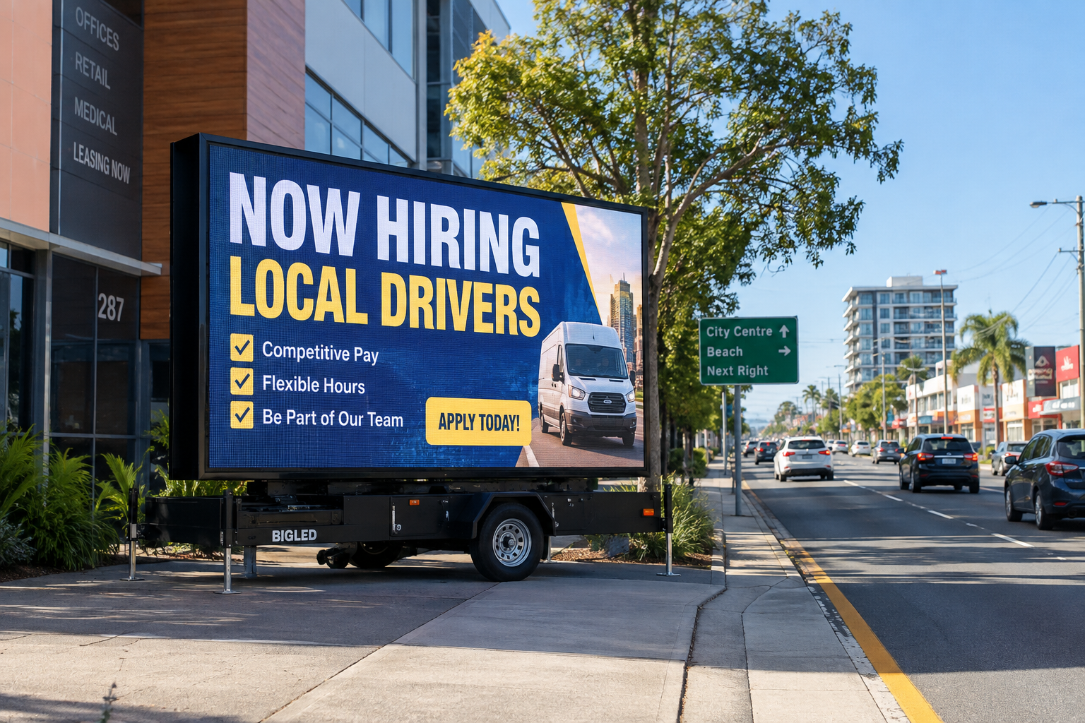
Ultimately, the call-to-action should match the campaign objective: more foot traffic, online clicks or phone enquiries. Signs of Success will ask you what outcome you want, then work with you to word the CTA accordingly. For instance, one example we often use is “NOW HIRING LOCAL DRIVERS” when clients want staff – this combines a direct benefit with an implied action (“apply today”) that can be supplemented online.
Distance, Angle and Testing: Design for Where It’s Seen
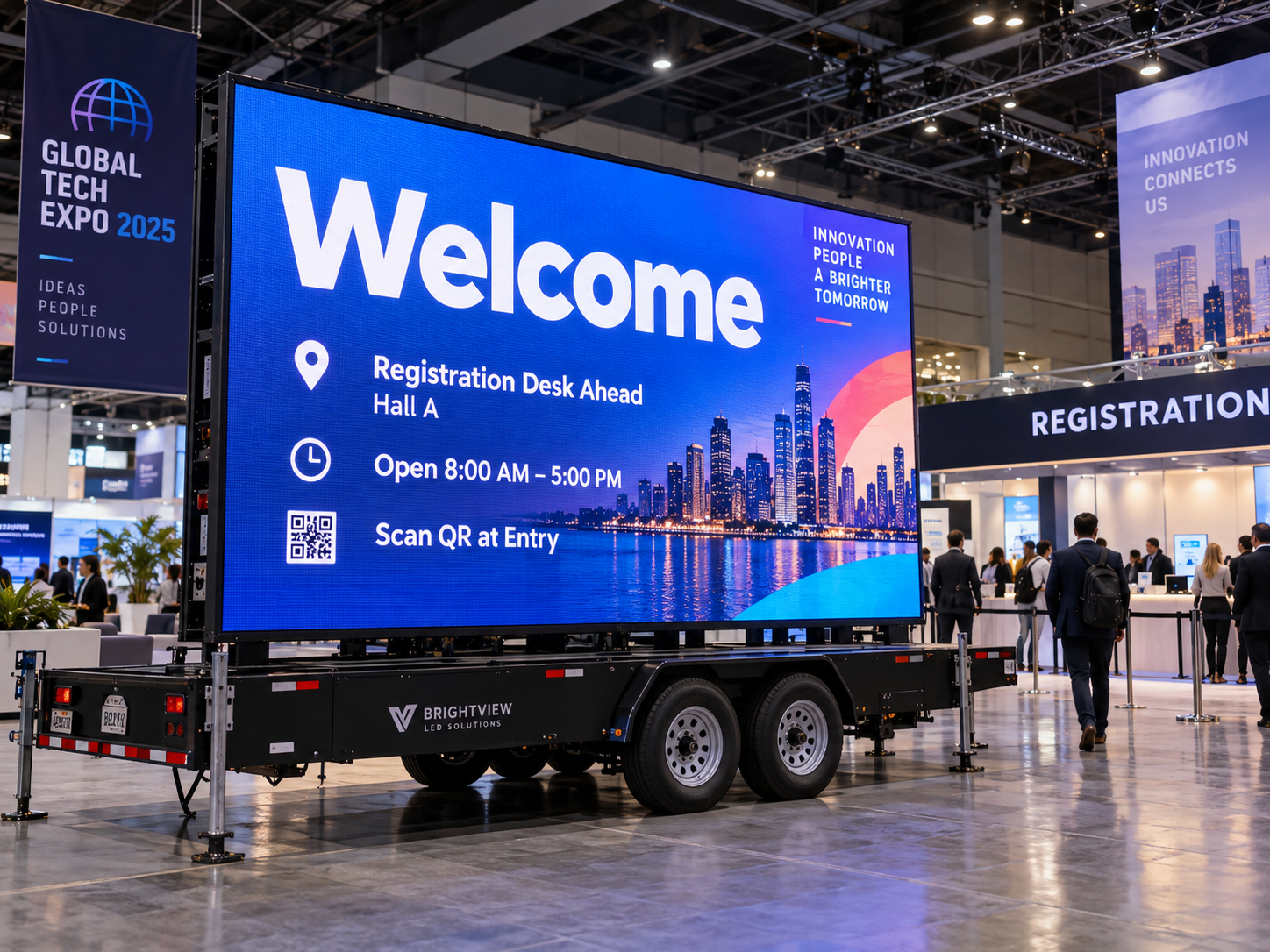
Every element above boils down to this: design for the viewer’s situation. If your mobile billboard is parked on a highway or fast road, assume people have only seconds and tens of metres to see it. If it’s in a shopping centre or event venue, people might walk by and have more time. Signs of Success recommends always testing your draft design at scale or from a distance – for example, viewing it on a smartphone or standing several metres away from a monitor. A good rule is the old outdoor-ad “10-foot rule”: text legible at 10 feet in pixels means it should be legible at ~100 feet on the actual sign.
In practical terms: keep the main content centred and unobstructed. Make sure trees, parked vehicles or architecture won’t hide the sign from the intended viewing line. Think about the angle: if the trailer will be facing oncoming traffic, the screen should be on that side. If it’s visible from multiple approaches, consider slightly angled placement or multiple slides addressing each direction (we can deploy more than one trailer in a campaign if needed). At Signs of Success, we’ll discuss your chosen location beforehand to ensure the message placement is optimised. And during final checks, we’ll confirm that the design is still readable and attention-getting from the actual road or footpath distance, adjusting text size or layout as required.
Daytime vs Nighttime: Brightness and Colour
Our LED trailers are built to shine in daylight, but the same design principles apply at any time: high brightness and contrast prevent the text from fading into glare or darkness. In bright sun, avoid very light-on-light color schemes. At night, dark backgrounds with light text often look even more striking (but a pitch-black background with white text remains highly legible). We also test content under different ambient conditions. If your campaign spans dusk or rainy weather, we ensure your colors and fonts remain visible at full daylight settings and during evening. In any case, the core rule – big, bold and simple – covers both day and night scenarios.
Before-and-After Example
To illustrate the difference, here’s a quick example of redesigning a cluttered ad into a clear one:
- Before: “[Logo] Huge Warehouse Sale – All kitchen appliances & furniture 30–50% off! This Sat & Sun only. Over 200 items clearance. Visit our store at 15 Smith St. Ends Sun.” (This might be one slide on a static sign.)
- After: On our mobile LED sign, we’d split this into two or three slides. Slide 1: “WAREHOUSE SALE – 30–50% OFF” (big text, store logo). Slide 2: “THIS WEEKEND ONLY – SUN 12PM CLOSE” (same style). Possibly Slide 3: directional cue “TURN LEFT” with store name if needed. Each slide uses ~3–5 words in very large font. This way, the sign isn’t trying to cram all the details at once – it delivers a punchy lead offer and a clear instruction.
You might also alternate a photo of a featured sofa or fridge between those text slides (as a visual hook). By comparison, the original dense message would be nearly impossible for a driver to read in time.
Don’t Make These Common Mistakes
- Avoid long sentences. Keep grammar simple – people skim, they don’t read paragraphs.
- No tiny text or fine print. Any text smaller than your main headline (like terms or small disclaimers) likely won’t register. If you need terms, keep them off the LED screen or rotate them slowly if absolutely required.
- Don’t overuse color or animation. Too many clashing colors or rapid movements will actually reduce readability. Stick to a restrained palette and minimal animation.
- Don’t ignore approvals. Make sure your design doesn’t look like a traffic signal (avoid red/green blinking in a confusing way) or violate any local signage rules. When you hire Signs of Success, we help check that your creative meets Queensland’s outdoor guidelines.
- Avoid static messages for too long. If your promotion changes or runs longer, update the billboard copy. Otherwise, viewers may stop noticing it. Digital signs are most powerful when refreshed – we encourage rotating the slide deck a few times during longer campaigns.
Build a Message Sequence Instead of Treating Every Slide as a Separate Advertisement
One of the most effective ways to use a mobile digital billboard is to think of several slides as one short communication sequence rather than a collection of unrelated advertisements.
When motorists or pedestrians have only a few seconds to notice a screen, each slide should perform one simple job. Trying to explain the offer, introduce the brand, show several products, provide contact details and communicate urgency on the same screen usually creates clutter.
Instead, divide the campaign into a logical sequence.
For example, a retailer running a weekend promotion might use:
Slide 1:
30% OFF
Slide 2:
THIS WEEKEND
Slide 3:
TURN LEFT – SHOP NOW
The first slide attracts attention with the strongest offer. The second creates urgency. The third tells the viewer what to do next.
A mobile LED billboard promoting an event could follow a similar structure:
LIVE MUSIC SATURDAY
followed by:
FREE ENTRY – 6PM
followed by:
NEXT LEFT
This approach gives every message more visual space and allows headline text to remain large enough to read from a practical viewing distance.
It can also be useful when a campaign has several priorities. Instead of placing three offers on one digital billboard screen, allocate one slide to each message while maintaining the same colours, fonts and visual style. The creative still feels like one campaign, but each idea has room to breathe.
Signs of Success can help clients decide which information belongs on the screen and which information is better left for a website, landing page or staff member to explain. In many cases, the job of a mobile LED sign is not to provide every detail—it is to create enough interest for the viewer to take the next step.
The sequence can also change as the campaign progresses. A sale might begin with:
SALE STARTS FRIDAY
and then move to:
SALE NOW ON
before finishing with:
FINAL DAY TODAY
Because Signs of Success can support remote content changes, businesses can keep their LED trailer advertising aligned with what is actually happening rather than leaving outdated creative on display.
Whether you are using a portable LED billboard for a promotion, opening, event or local advertising campaign, the principle is simple: one screen, one job, one clear idea.
Signs of Success can help structure the slide sequence so your mobile electronic signs communicate quickly, remain visually consistent and make the most of the few seconds you have to capture attention.
How Signs of Success Can Help
Designing an LED billboard message can seem tricky, but you don’t have to do it alone. Signs of Success specialises in mobile LED advertising across the Gold Coast and Brisbane. We’ll help you by:
- Content Advice: We can review your text and imagery to ensure it follows all the guidelines above – simple, short, high-contrast, one message at a time.
- Remote Updates: As your campaign runs, we can change the slides for you (e.g. from “Sale Starts Friday” to “Sale Now On” to “Final Day”) so your billboard always matches the moment. You just tell us what you need.
- Design Services: If you have artwork or logos, we’ll format them for the screen. We even have built-in templates proven to maximise readability. If needed, we can add simple graphics or design a background in line with your brand.
- Technical Setup: We deliver a high-resolution LED trailer, park it at the agreed location, and set brightness for optimal visibility. Our team will ensure the sign is facing the right direction and that nothing obstructs the view.
- Local Expertise: We know the area’s high-traffic spots and local rules. We can advise on placement to catch your target audience – whether it’s commuters, shoppers or event-goers – and make sure the content fits that context.
When you hire a mobile LED sign from Signs of Success, you get more than just hardware – you get a partner for your advertising message. Our goal is to make your promotion as hard to miss as possible, with content that people can understand in seconds.
Ready for a Billboard That Works?
A well-crafted mobile LED billboard is not just a bright screen – it’s a powerful marketing tool. By putting only the essential words and images on that screen, you turn passing traffic into customers. Signs of Success is here to help you nail the creative and technical details.
Contact Signs of Success today for help with designing and scheduling your mobile digital billboard campaign. We’ll work with you to finalise a clear, concise message and ensure your next promotion, opening, sale or event gets maximum attention.
Let’s make sure your message is loud, clear and unmissable. Speak to Signs of Success now for expert advice and a tailored quote!